Hello,
As some of you may have already noticed, we have a “new look”. Runarcana now has a new logo and a new visual identity that were designed for Runarcana's purpose both for today and for tomorrow (the future).
Antes de falar do novo logotipo, preciso falar um pouco sobre o logotipo e a identidade antiga, como eles foram criados, quais eram os conceitos e ideias que moldaram aquela percepção, para que então possamos falar sobre o novo logotipo.
Old Logo
The old logo was designed and executed by myself and a collaborator who is no longer part of Runarcana, Luke Nitole. The entire idea of the logo was centered on Runeterra, with several elements that refer to that world, from the silhouette of the Baron Nashor and the Elder Dragon (although the model used was the Infernal Dragon), to the chosen font, which is a used by Riot for League of Legends mostly, and even in the central design of the logo that represents the map of Runeterra.
Runarcana's visual identity was made up of 3 versions:
The full version

Composed of the two silhouettes of the creatures (Baron and Dragon), the name “Runarcana” and “RPG” written with the Beaufort typography (League of Legends font) in addition to a framing based on a fragmented triple hexagon. The lengthening of the R and the last letter A served to frame the word RPG and bring it into the composition of the logo, while the cuts in the letters were made in an alternation of full cut and partial cut to diversify the font while referring to the idea of alternation and dynamism, in which all letters have their internal divisions, a reference to the layers of Runarcana.
The medium version

Composed of the two silhouettes of the creatures (Baron and Dragon) with a double hexagon framing a simplistic reproduction of the current map of Runeterra.
The Symbol
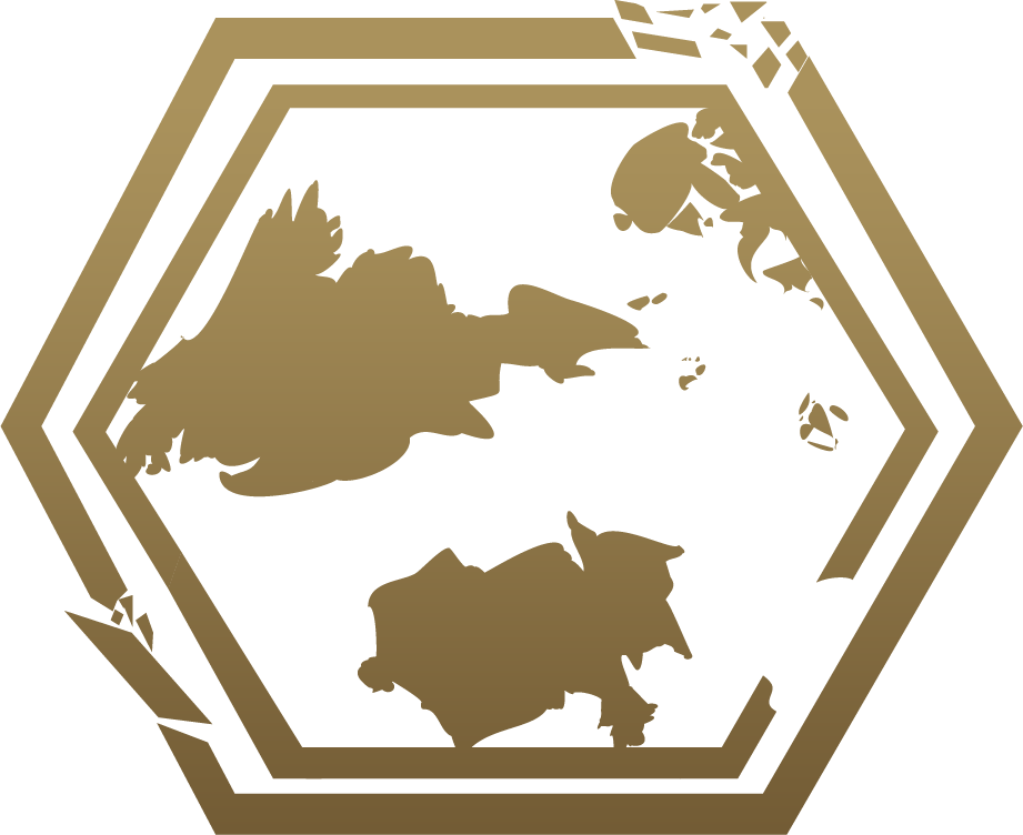
Composed of the double hexagon with fragments and the simplistic reproduction of the current map of Runeterra.
The visual identity itself, which also involves the choice of how to use the logo, type or logo, was closely linked to the forms presented by Riot in its concept “Hextech” (which is partly maintained in the new identity), especially due to the use of golden tones reminiscent of the gold, bronze and brass common in steampunk aesthetics.
Therefore, we can summarize the old visual identity as follows:
- Baron and Dragon
- The current map of Runeterra
- The font used in League of Legends
- Font modification
- The Hexagon (or hexagons)
- RPG
Each of these elements ended up proving problematic or no longer desired during the development of Runarcana:
- Baron and Dragon.
Unfortunately, the aesthetics of the two creatures, in addition to being the property of Riot Games, refer to a look that can be modified at any time, as recently happened with the Baron.
- The current map of Runeterra
Although it is still the current map of Runeterra that we have access to, we already know about the existence of other lands that are not on this map, such as Camavor and Kathkan which are on another continent.
- The font used in League of Legends
Although it is a font that will continue to be used in graphic pieces, it is no longer the priority source for composing content and is no longer the main source of the system's identity as it is not even a priority on the part of Riot Games.
- Font modification.
The tentacles only existed to frame the “RPG” with the function of giving weight to the logo, making it not just a “rectangle”;
- The Hexagon, or hexagons
The excess of hexagons was confusing and inconsistent, in addition to the excess of fragmentations not working in the logo in small or even large sizes (in which it was noticeable how “unnatural” these fragments were)
- RPG
Since the name Runarcana refers to an RPG system, it often became redundant.
The new Logo
For these reasons, any old visual identity was considered inadequate, with the need to create a new visual identity avoiding past mistakes, consolidating a new perception about Runarcana and bringing characteristics that refer to Runarcana as a product that, although it can be set in Runeterra is not limited to this.
With this in mind, the new identity began to be conceived, going through the stages of idealization, design and execution. Some of the important points for the new logo to be created were:
- Simplicity: No excess graphic elements, prioritizing form and function in each element rather than complex compositions to obtain identity
- Clarity: The symbol should work well both in large and small sizes for various purposes ranging from printed applications to electronic applications (such as website icons, publications on social media, etc.)
- Solidity: The general idea of the new logo should convey firmness and solidity, representing the search for consistency in rules and scenery, while at the same time referring to something “energetic and magical” representing the dreamlike, imaginative and recreational.
In this way, the new logo was created as the center of the new visual identity. It was not a quick creation, there were several iterations for the current one to be achieved and along the way, the important points above often ended up being left aside, giving air to the imagination as a creative exercise.

Ultimately, once complete, the new logo has 4 main elements:
- Hexagon
The Hexagon refers to both “Hextec” and D20 (through the two-dimensional projection of the icosahedron, one of Plato's solids) the main dice of the system, which is why its inclination was changed, having a central axis. This same hexagon is overlapped by the next element, the Rune:
- Rune
The “Rune” is at the same time something derived from the hexagon and the creativity that the RPG refers to, with its upper part “coming out” of the hexagon, although it has the same angle, it has “natural and organic” traits of something non-mechanical. This Rune crosses the hexagon, which represents the D20, referring to the RPG experience, in which there is a continuous exercise of generative creativity, conditioned to the result of the dice as mediators, once again becoming something creative in a perpetual cycle.
- Letters
The font chosen for the type is a wider font, having a more striking presence that refers to solidity (in addition to working properly in different sizes), better legibility, being visible more easily and consequently having greater prominence.
- Cuts
The function of the cuts, in addition to giving dynamism to the text and creating a strangeness that increases its prominence, refers to the dynamism of the system, designed in such a way as to have several optional sub-systems in a similar way to a puzzle, rescuing the perception that RPG is a game and not just a storytelling tool.
Each of the 3 main points of this new logo were achieved. Once again a joint creation, but this time with my conception and Dennys Henrique's execution.
The current logo manages to bring together Simplicity, Clarity and Solidity in its applications, which are fewer than the previous logo, but which can be expanded through the use of different palettes, such as gold, white/silver, purple and blue . Each of these color combinations was designed to respond to some needs that must be presented during project launches.
And although he mentions Runeterra, it is not limited to that, demonstrating that Runarcana is an RPG system that can be used for adventures in different scenarios, not just Runeterra, opening up future possibilities for other scenario adaptations or even publications of totally new scenarios.
Damn References
The font (type) had already been chosen, with the symbol (logo) still in the development process. To produce the logo, several references were selected by researching existing logos with the words hexagon, runes, crystal, energy, among others, to serve as inspiration, below are some of them.
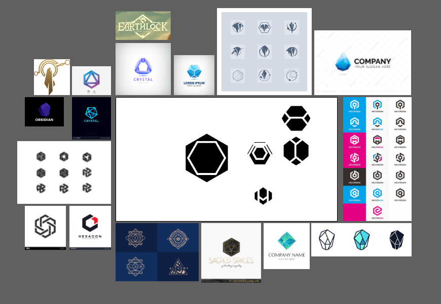
As you can see, there were many logos used as references, and the number of iterations of the logo was even greater, as can be seen below.

Once the logo was ready, a search was carried out on TinEye and Google Images, looking for similar logos so that no problems would arise. As no identical or even similar logos were found, we moved on to the application phase, creating the pieces where it would be used, from wiki, website, social networks, etc.

After application, this article began to be written, bringing together all the information generated during this logo creation process, with the aim of showing the public the bases and ideas. It was during this process that I came across the Shardbound game logo and was astonished by the similarity, as you can see in the Shardbound logo below:
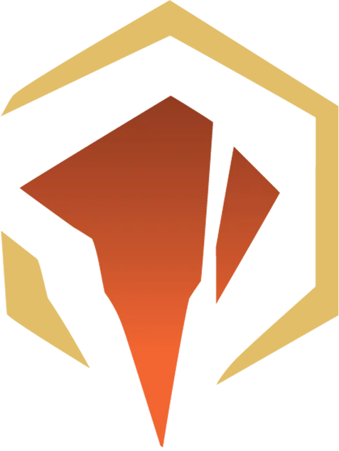
Yes, it is very similar although visibly different. At the same time I realized this, I was very worried that I had committed plagiarism, as the idea and concept of the hexagon and rune can be seen in the different iterations of the logo. It would be terrible to commit plagiarism, so I opened the various documents that were created during the creation of the logo again, to try to understand how this would have happened.
During this examination I found these sequences of images that were found on the internet by searching for “hexagonal logos” and were attached to the references.

When searching for the image source, I ended up finding the Artstation by Samuel Thompson, which is where this image came from, part of his graphic exploration in creating the Shardbound logo:
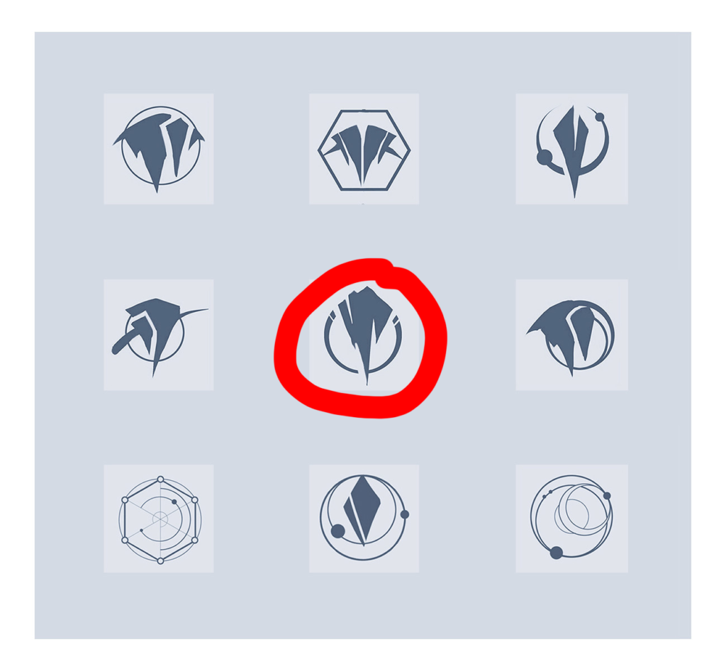
As can be seen, the “Rune” is very similar to the central symbol of this graphic exploration, but its main inspiration was the concept presented in the Targon logo, which can be seen both in the panel with references and below:

During the execution of the Runarcana logo, the Shardbound logo was not known, but it is undeniable that it is possible to see it as one of the results of Samuel Thompson's graphic exploration.
Although they are similar, the two logos are very different, both in their final execution and in their application, which is why I chose to keep the logo.
This situation may seem problematic, however it is more common than you might think, as can be seen in this article. The occurrence of similar logos is already a common occurrence, for this reason, I believe I am not violating any ethics by using what was created by two people.
This new phase of Runarcana is a commemoration and a celebration of 5 years of the project's existence and the milestone reached of finally entering the final stretch towards completing the system and launching the long-awaited version 1.0 of this project.
In the future, we will talk about the New Runarcana Visual Identity, which includes not only the use of the new logo, but also the choices of aesthetic and conceptual elements, in addition to the typographic families chosen to compose all of Runarcana's pieces, from books to websites. , social media shares and more.


Leave a Reply